4 November 2026Design5 min read
Packaging design that helps products get chosen
Picture a customer standing in front of a shelf of unfamiliar products. Several offer something similar. Each has a name, a colour palette and a promise. The customer picks one up and begins to read. Packaging is part of that decision. It introduces the brand, identifies the product and helps set expectations about what is inside. It also gives customers practical information they need before purchasing.
For a business investing in packaging design, the brief therefore reaches beyond creating an attractive front panel. It needs to consider the product, the audience, the category and the wider range. At Phew Interactive, we approach packaging as an expression of the brand that must also communicate clearly at the point of choice.
Begin with the product and its audience
Before choosing colours or typefaces, establish what the packaging needs to say. What is the product? Who is likely to buy it? Where will they encounter it? What makes it relevant to them? A snack purchased on impulse has different communication needs from a food product someone is comparing carefully. A familiar product entering a new market may need more explanation than it does at home.
These questions give the design a direction. They also help a business distinguish between a meaningful product difference and a decorative idea that looks appealing but tells customers very little.
Make the essential information easy to find
Packaging asks customers to read several things at once: the brand name, product name, flavour, quantity and other relevant details. Those elements need an order. A clear hierarchy helps people identify what they are looking at before exploring the finer information. If every element competes for attention, even a visually energetic pack can become difficult to understand.
Phew’s packaging work for Krizp Whole Wheat focused on shelf presence, clear product communication and a visual language that could extend across a wider range. The project reflects the relationship between an identifiable appearance and a straightforward explanation of the product itself.
Build a recognisable family across the range
When a brand has several flavours or product types, the packaging needs both consistency and distinction. Customers should recognise the brand while being able to choose the variant they want. A common structure can hold the range together. Colour, product imagery or another deliberate visual cue can separate individual variants. The balance matters: too much similarity can cause confusion, while too little can make related products look unrelated.
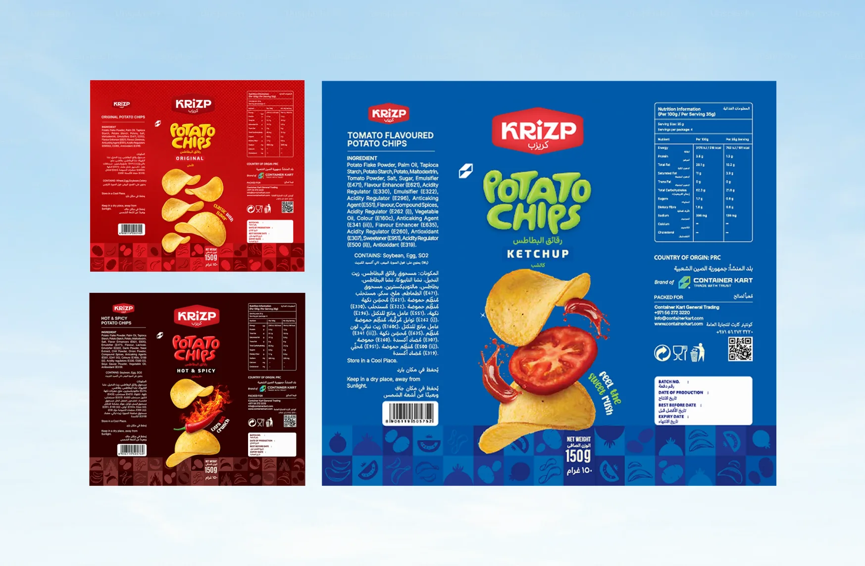
For Krizp, a snack brand developed under the ContainerKart ecosystem, Phew created packaging across multiple flavours. The documented focus was a bold shelf presence with a consistent brand language throughout the range. Thinking at range level gives future additions a clearer design foundation.
Create character that belongs to the brand
Packaging should express something specific about the business and its offer. A restrained treatment might suit one product, while another needs a colourful, expressive presence. Neither direction works simply because it is fashionable. The identity needs to remain recognisable when applied to different formats and products. That means considering how the name, typography, illustration and layout work together, rather than relying on a single striking colour.
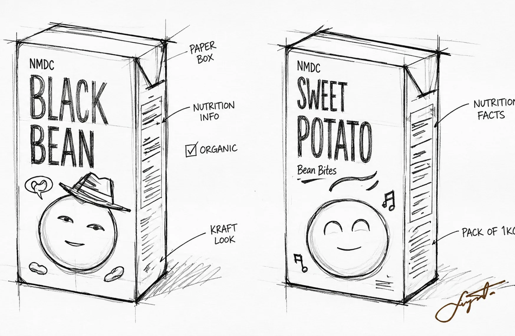
Our Mexican Choice project, also developed under the ContainerKart ecosystem, focused on a bold visual identity and distinctive packaging for retail and global food markets. The intent was to establish a recognisable brand expression that could carry through its packaging system.
Check the design beyond the presentation mockup
A polished mockup helps a team understand the proposed direction. The design also needs to be reviewed in the conditions where people will actually encounter it. Consider the size of the label, the shape of the container and how text wraps around a curved surface. Check whether important information remains visible when products are displayed together. An online product thumbnail introduces another scale at which the brand and variant should be understandable.
Production review matters too. The business, designer and printer need to agree on the format, artwork requirements and final content. Mandatory information and product claims should be checked by the appropriate responsible team before printing.
Give packaging a clear role in the business
Packaging can help attract interest and communicate value, but a sales outcome also depends on the product, price, distribution and customer experience. A useful design brief sets objectives the work can directly address.
Those objectives might include making variants easier to distinguish, improving product clarity or establishing a consistent appearance across a growing range. They give the business a more practical way to assess the design than personal preference alone. Strong packaging helps customers understand what they are choosing and recognise who it comes from. When identity, information and presentation work together, the product has a clearer introduction to the people it is made for.